Creating accessible digital content ensures that all members of our community — including individuals with disabilities — can fully engage with the information, resources, and experiences we provide. This site provides guidance for making web content, documents, emails, social media, events and online meetings, courses and learning platforms, and digital displays accessible to all users.

Accessibility Foundations

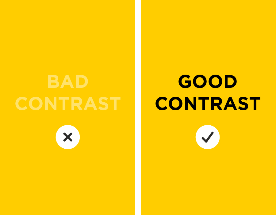
The following points are essential to building a foundational understanding of digital accessibility.

An example of good and bad color contrast

Color and Contrast

Color contrast is essential for accessibility because it ensures that text and visual elements are readable for all users, especially people with low vision or color blindness. 

When there isn’t enough contrast between text and its background, content becomes difficult or even impossible to read. Strong contrast helps users clearly see information on a page, reduces eye strain, and ensures that important content is not missed. 

Text must have enough contrast with its background to remain easy to read. This requires a contrast ratio of at least 4.5:1. You can use a Color Contrast Checker to confirm that your color choices meet this requirement. 

Do not rely on color alone to communicate meaning or emphasis. Always include additional cues such as text labels, icons, or patterns so that all users can understand the information regardless of how they perceive color.

An example of three levels of headings: Heading 1, Heading 2, and Heading 3

Headings

Headings are one of the most important elements in digital accessibility because they provide structure, navigation, and meaning especially for people using assistive technologies. 

Like chapters in a book, headings organize content into sections, helping all users quickly scan, understand, and navigate your content. Headings should always reflect the organization of your information, not just the visual design. 

Typically, Heading 1 (H1) is used for the top-level title, Heading 2 (H2) is for main sections, and Heading 3 (H3) is for subsections within those sections. Always use the same heading level for content of equal importance. Do not use headings for purely aesthetic reasons.

Never skip heading levels. For example, don’t jump from Heading 1 to Heading 3. Skipping levels can make it difficult for users to follow the content structure. 

An image with a speech bubble to represent alternative text

Images

Images are an important part of digital content, but they must include meaningful text alternatives (alt text) so all users can understand the information they convey, especially people using screen readers. Without alt text, users may miss important information or context that is only presented visually. 

Alt text should briefly describe the key information or function of the image, considering what the image is meant to communicate and its context.  

Do not include phrases like “image of…” or “picture of…,” and avoid vague text such as “Image 1.” 

Decorative images that do not convey information may have empty alt text or be marked as decorative, but when in doubt, include alt text. 

Avoid using images of text. Written content should be presented as real text whenever possible. Logos are an exception.

A link pointing from one webpage to another

Links

Links should clearly describe their destination so that all users understand where they will go, especially people using screen readers.

Vague or repetitive link text can make content confusing and difficult to navigate, especially for users who rely on links to understand and move through a page. For this reason, avoid using generic phrases such as “click here” or “read more,” as they do not provide enough information to be meaningful.

Use unique, descriptive text when linking to different destination pages. For example, instead of using “Learn more” for multiple links, use text like “Learn more about digital accessibility” or “Start creating accessible content.

A simple table with row and column headers

Tables

Tables are used to organize data. If they are not structured correctly, people using assistive technologies may not understand how the information is related. 

To ensure accessibility, tables must include clear column and/or row headers that describe the data. Each header should indicate whether it applies to a row or a column. 

Do not use tables for layout or visual design. Only use them to present data. Avoid complex tables with features like merged cells which can make the content difficult to navigate and interpret.

A video with icons for a transcript, captions, and audio

Video and Audio

Video and audio content are essential parts of digital communication, but without accessible alternatives, users who are deaf, hard of hearing, blind, or have low vision may miss important spoken or visual information.  

Videos must include accurate captions so users can read spoken dialogue and important sounds. Audio content must include a transcript so the information is available in text form. 

Automatically generated captions must be reviewed and corrected for accuracy. 

Any important visual information in a video, such as charts or on-screen text, must also be described in the audio so that users who cannot see the content can still understand it.